Streamlining the workflows of a cloud-based B2B cybersecurity platform
OVERVIEW
OVERVIEW
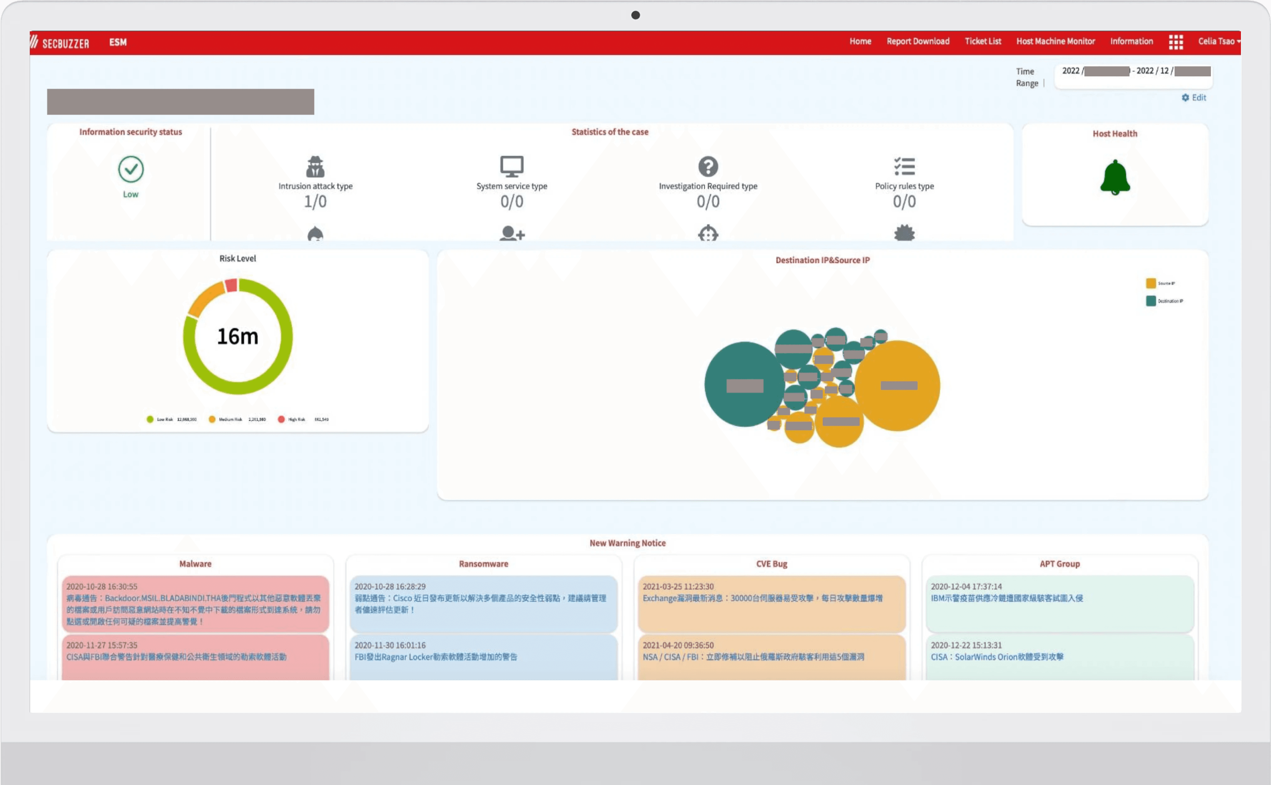
SecBuzzer Network Detect & Response (NDR) service supports 20+ organizations to detect and respond to cyber threats effectively.
As the founding UX designer at a cybersecurity startup, I helped streamline navigation and improve rapid response to security events of a cybersecurity dashboard by leading end-to-end research and design: designing user surveys, analyzing data, translating findings into design decisions, running usability testing, and partnering with engineering and PM to iterate on the product.
MY ROLE
Lead Designer and Researcher
TASK
Competitive Analysis
User Survey
UX design
Usr testing
Presenting
Stakeholder-
communication
TEAM
Collaborated with:
2 Product Managers
2 Backend engineers
1 Frontend engineer
DURATION
Dec 2021. – May. 2022
(Shipped)
OUTCOME
This was the first UX research and design function launched at the company initiated by me.
The new design was launched in June 2022
20 of 31 organization users were more active 90 days after launch
Increase in user satisfaction ratings after the redesign
TIMELINE
I was in charge of the entire design and research planning process, collaborating with 2 product managers and 2 engineers to iterate and fine tune the solution, the new design was launched later.

THE PROBLEM
Organizations must actively track cybersecurity events, but busy users often neglect complex dashboards, resulting in missed threats and delays.
Quaterly user survey revealed that the way information was presented and designed affected user retention and their willingness to make future purchases.
CHALLENGE
How might we streamline monitoring process to help user access information more efficiently to enhance responsiveness and engagement?
OUR USERS AND WHAT THEY NEED
Users need to process critical security information quickly, often while multitasking or moving between tasks
The product focuses on network security within healthcare organizations, including medical centers and hospitals.
Our primary users were identified as healthcare information managers—busy, security-focused professionals who are often on the go.
"My work is usually really busy. I'd like to check the dashboard with my laptop or phone, but there’s just too much information to read."
— PARTICIPANT @ MEDICAL CENTER
DESIGN HIGHLIGHTS
More streamlined flow with visualization to help users access critical information efficiently
Dashboard's Information Architecture
01
Based on user research, we identified and prioritized information needs by urgency during a cybersecurity incident, using data visualization to help users quickly grasp key information.

BEFORE

1
2
3
4
AFTER
① Information Architecture
Consolidated related information into unified sections to streamline the hierarchy and enhance organization.
② Data Visualization
Merged IPs into a single visualized section, using color for clarity and distinction.
③ Simplification
Simplified overall UI and removed less relevant data.
④ Added text bubbles/tooltips
Tooltips were introduced in "Ticket Status", "Alerts", and IPs to provide contextual information for icons and graphics, helping users navigate multiple categories without needing to recall them each time.
Previous design placed
💡 Why the change? Breaking barriers to engagement
Users struggled to navigate the dashboard and find information.
An overload of irrelevant information overwhelmed users and hindered key tasks.
The lack of visualized data and reliance on numbers increased users' cognitive load.
Platform's Overall User flow
02
Our research identified another user pain point: difficulty finding information via dashboard links.
I reorganized the page structure and feature links under each main menu on the dashboard to improve intuitiveness and accessibility.

BEFORE

AFTER
💡 Behind the change: Content hierarchy to improve user flow
Secondary features that provide lower-priority information.
Top-level features and critical information for quick access.
All the detailed, less urgent, and more granular data on the innermost pages.
Second-level
Dashboard (First Priority)
Third-level
RESEARCH HIGHLIGHTS
The current information hierarchy created friction that reduced daily engagement
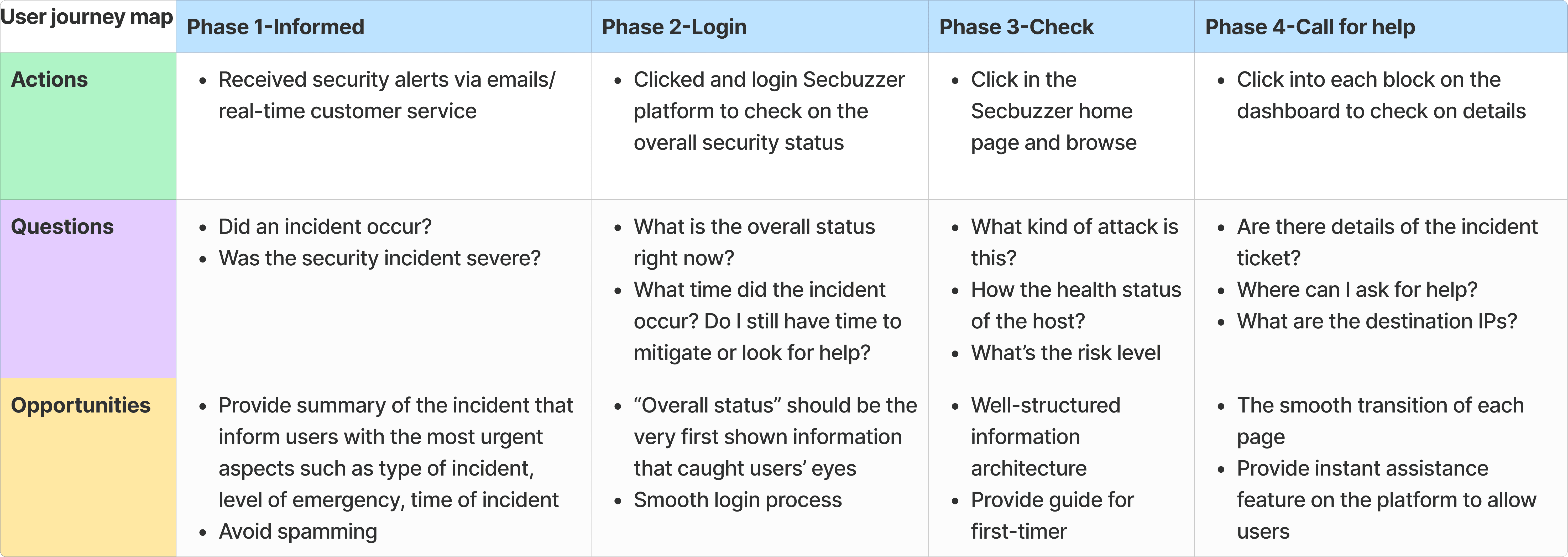
By conducting a competitive analysis of 5 products on the market, a user survey (n=31), and 5 interviews, and revisiting user journeys, I synthesized three critical pain points to address:

The biggest takeaway from analyzing competing products is that they consistently rely on a severity-first hierarchy paired with progressive disclosure.
This aligned with our user survey findings: since cyber incidents demand immediate response, being able to review overall status alongside the latest and highest-risk alerts is most critical to users, a need I addressed through the information prioritization work shown below
I also applied progressive disclosure at the interaction level — introducing contextual tooltips across "Ticket Status," "Alerts," and IPs so users could access supporting detail on demand without the interface feeling cluttered by default.

DESIGN PRINCIPLE
Based on our research, I prioritized the following three principles in designing the solution:
01 Design for intuitive navigation, so users can find information without friction
02 Prioritize time-sensitive and critical information, reduce redundancy, and reveal details progressively
03 Design for consistency — align terminology, platform, and related channels to lower time costs and communication risks.
FEEDBACK, ITERATION, AND TESTING
Reviewing and aligning the solution across teams
I led internal usability testing sessions and four design specification meetings to gather feedback and align with the teams I collaborated with on this project. We also ran A/B tests on the new design, then collected lightweight feedback from users to guide UI iterations and refine the information architecture.
IMPACT
First UX initiative, and more in the future
This project not only is the very first UX project in the company, but it also effectively enhanced the startup’s focus on UX, leading to 3+ UX-focused monthly meetings for future products.
Our team have not stopped but continued to work on more redesigns in order to improve the overall user experience, and as our very first iteration, the engagement rate increased 17% in the following months, we also received positive feedback from users that the dashboard had been easier for them to use, and that the information was clearer than before, which made their access easier and faster.
TAKEAWAYS
Bridging the gap between design and engineering
This was the first UX initiative at the startup, and my first time working directly with an engineering team. As the sole designer, pushing new ideas wasn't always easy, and execution on the engineering side had its own challenges.
Working closely with the engineers taught me their language: the open-source UI components they used, front-end terminology, and how they perceived usability issues. Taking the initiative to learn to bridge that gap, and to advocate for change even when a so-called 'issue' actually worked fine for them, helped me push this project through smoother cross-team collaboration, from approval to testing to launch.