
Feature Experimentation Platform
Usability Study
RESEARCH HIGHLIGHTS
Who are the target users for this test?
Test Participant
Quantitative
Task success rate of one single step in each task
The number of clicks to complete a task, compared with the minimum clicks simulated
Time on task
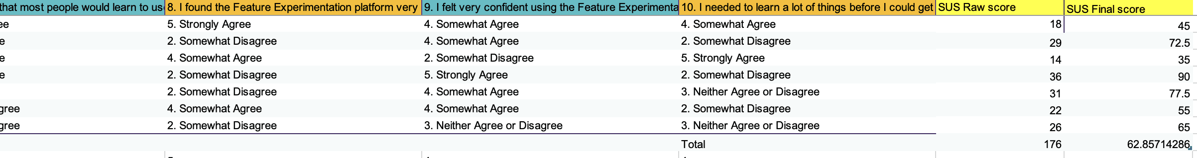
System Usability Scale(SUS)
Data Collection
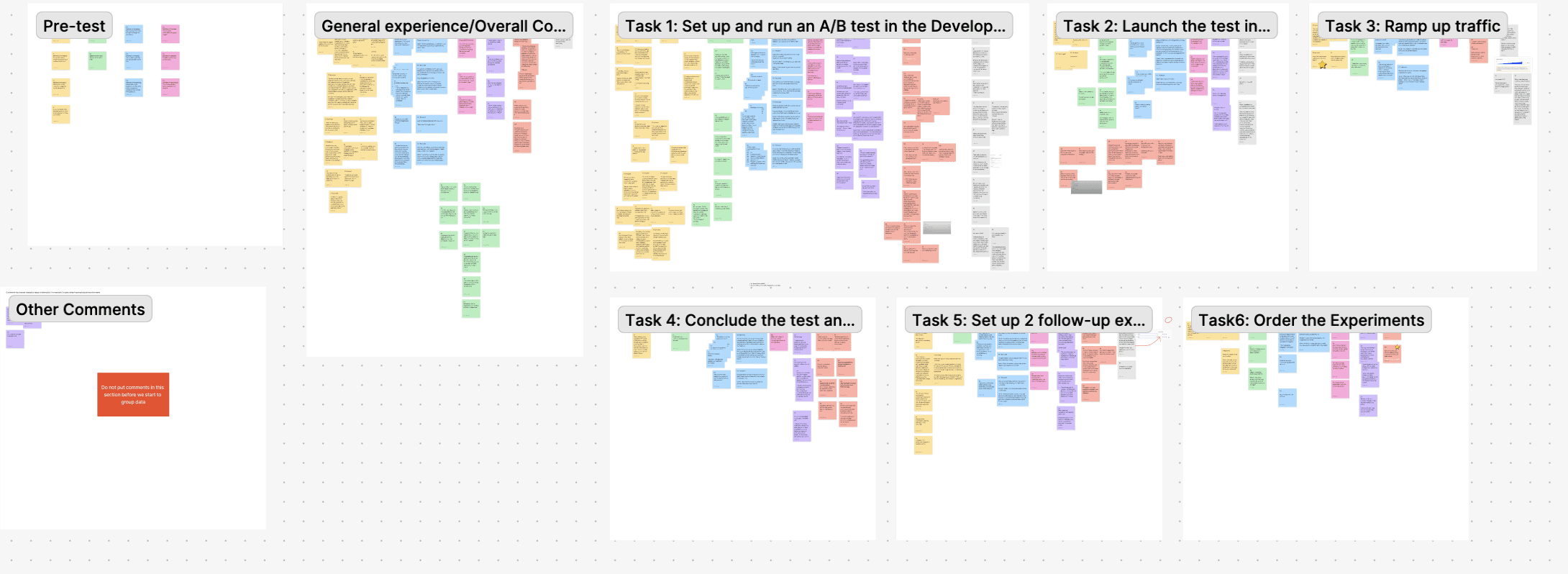
A mix-method of both quantitative and qualitative data were collected during the test to identify and affinity group users' confusions and feedback for the product, then the severity of the themes were further assessed using quantitative data.
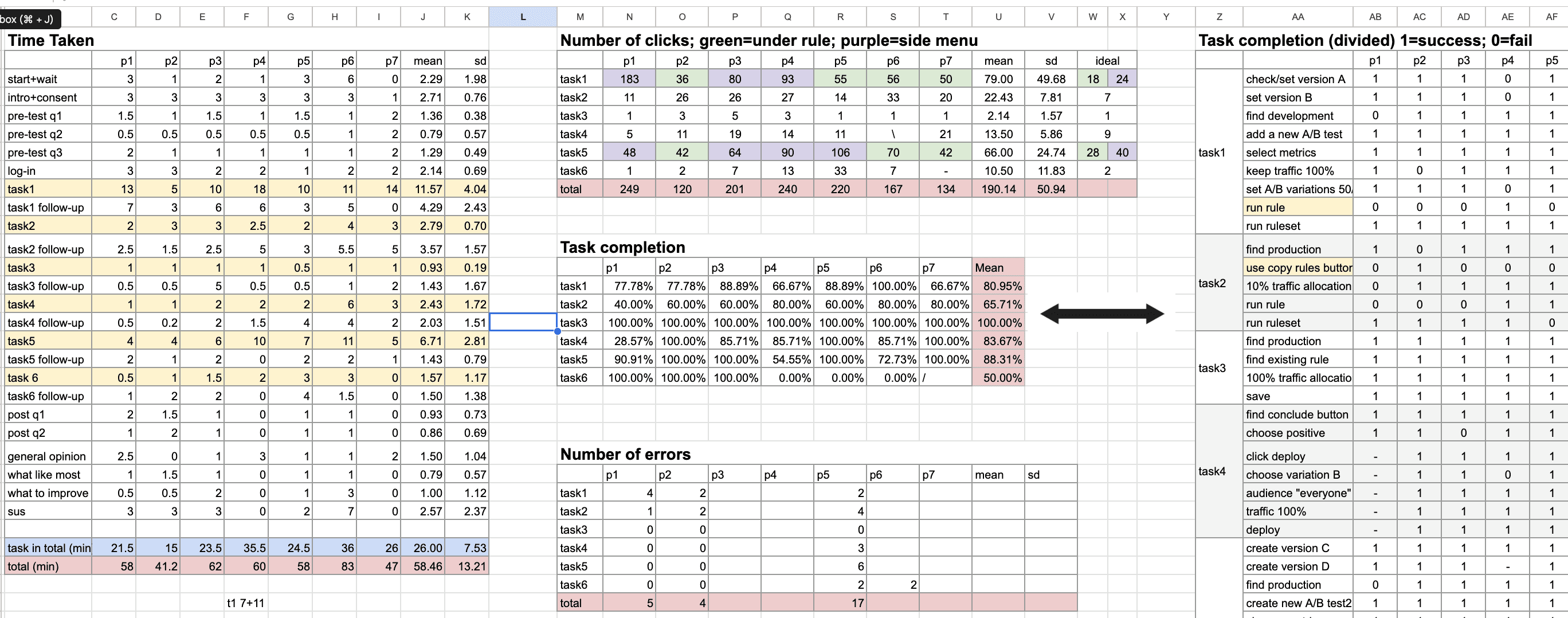
Level of severity: Low success rate > Delayed time on task > Confusions with low effects on tasks
Qualitative
User flow/click pattern
Implicit cue: Tones, attitudes, or feelings observed in the test
Literacy: The level of understanding of the word usage and structure division
General feedback: Suggestions and expectations provided by participants
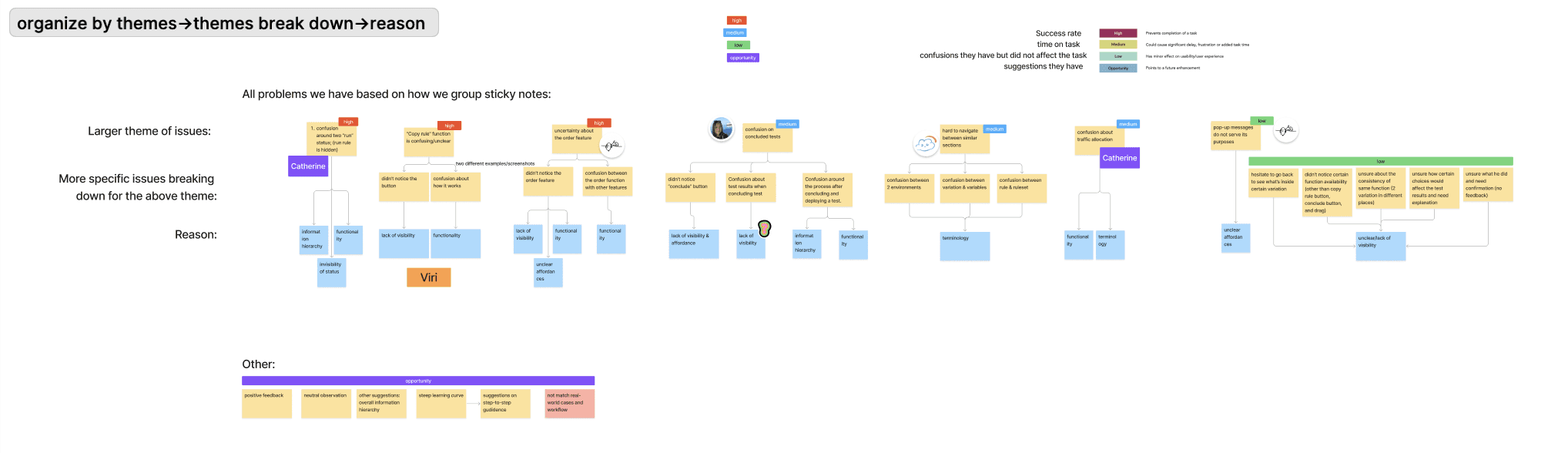
Affinity mapping: Themes among tasks > Themes across tasks > Reorganize themes with reasons broken down
PROJECT OVERVIEW
Optimizely’s Feature Experimentation is a business content management platform for A/B testing, enabling targeted design delivery via feature flags—allowing feature toggling without code modifications.
As part of the UW HCDE 517 sponsored project, our client, Optimizely, received user feedback indicating that the platform felt unintuitive and confusing.
Our goal was to identify specific usability issues contributing to this confusion and provide actionable design recommendations to enhance customer satisfaction. We conducted the study in close collaboration with Optimizely's product managers.
DURATION
10 weeks
(Jan-Mar 2025)
PRODUCT
A/B Testing Platform
ROLE
UX researcher
Worked with:
2 Product Managers
4 Researchers
TASK
Remote Moderated interview
Data Analysis
User research
Usability testing
Reporting
Client communication
RESEARCH GOAL
Pinpoint detailed usability issues within the platform’s interface to deliver actionable improvements for enhanced user satisfaction and success rate of launching A/B tests.
RESEARCH QUESTION
How intuitive is Optimizely’s Feature Experimentation product for setting up and managing A/B tests?
What challenges and frustrations do users face when navigating and using Optimizely’s Experimentation feature?
How well do users understand the purpose and functionality of the Feature Experimentation interface while running AB testing?
IMPACT
I led 4 of 7 usability tests and guided the data analysis process, prioritizing qualitative insights to define usability issues and leveraging quantitative data to assess their severity.
My team successfully delivered the final report and presented our findings to the Optimizely product team. Our insights will be adopted by Optimizely's UX researcher in Q2 2025 to inform the platform redesign.
Task Design
The tasks are designed based on a hypothetical A/B test workflow for a product manager testing the hypothesis that changing the website’s homepage banner will increase user engagement.
Each tasks were tied to a main workflow a user would encounter when launching an A/B tests, as well as some specific features our client would like to assess.
Task 1: Set up and run an A/B test in the Development Environment
Task 2: Launch the test in the Production Environment
Task 3: Ramp up traffic
Task 4: Conclude the test and Rollout the winner
Task 5: Set up 2 follow-up experiments with specific user segments under the same feature flag in the Production Environment.
Task 6: Re-order the experiments

SUS was adopted following the user testing to assess participants' perceptions of usability, and was employed alongside user testing to validate the findings. The resulting SUS score for this study is 63, which falls below the average benchmark of 68.
SUS (System Usability Scale)
Remote moderated interviews were conducted through Microsoft Teams and Zoom, with 7 participants (5 of them experienced in A/B testing, 1 limited, and 1 outlier with none)
Interviews &Observations
Pre-Test Interview(5 min): Define the participant's A/B test experience level.
Moderated Usability Testing(40 min): Participants completed six tasks while thinking aloud in a hypothetical scenario, followed by post-task questions.
Post-Task Debrief & Questionnaire(5 min): Using the System Usability Scale (SUS) to measure product usability.
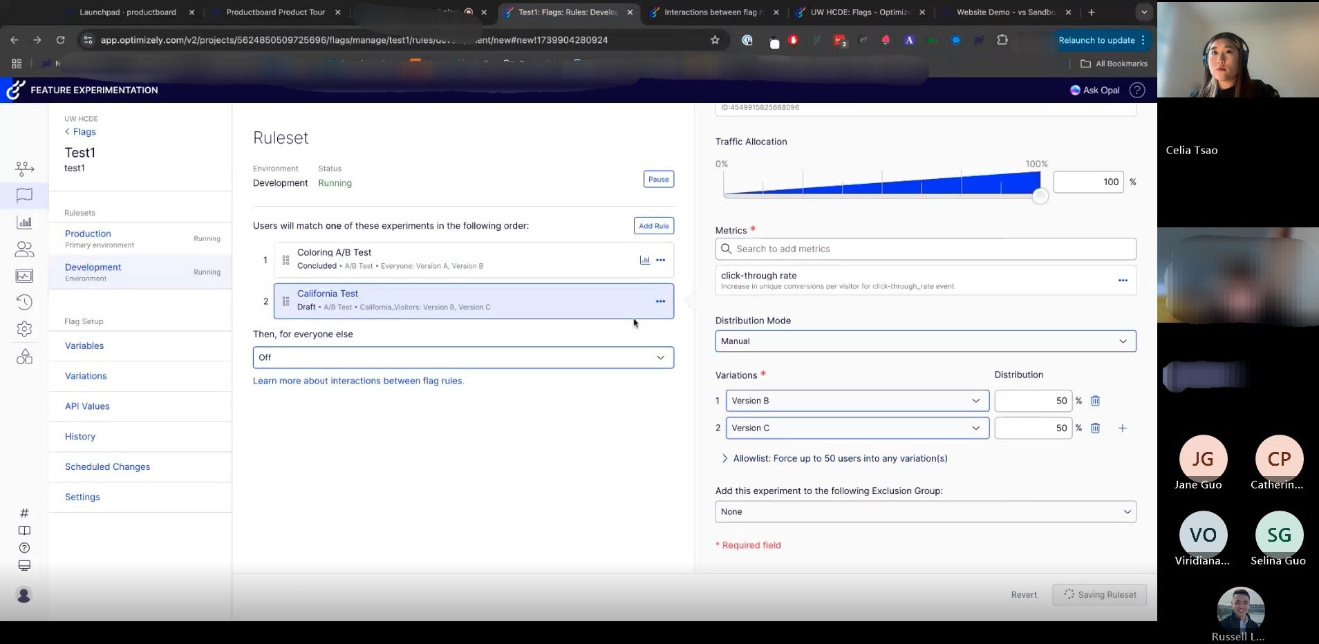
Highlight 1: Most Participants are confused around the two “run” status
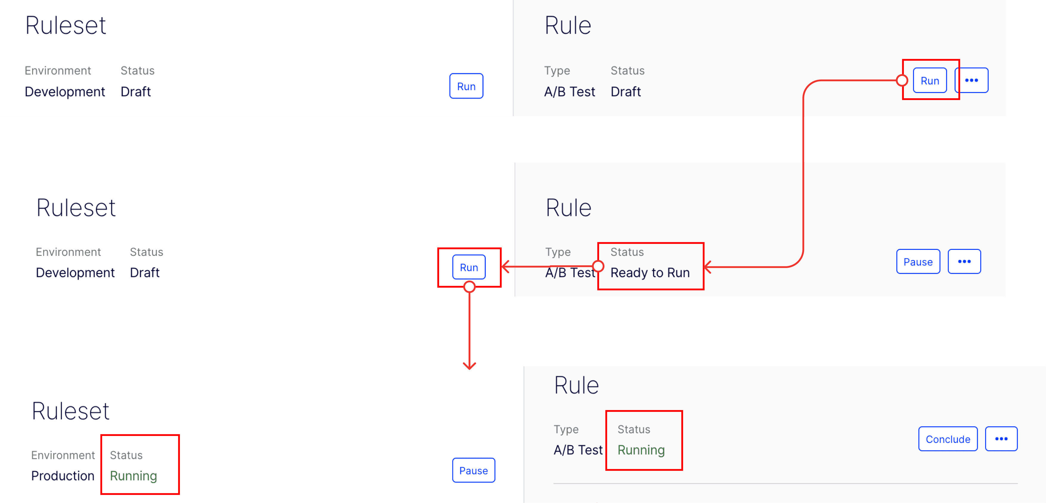
Users must click "Run" in both Rule and Ruleset, but they struggle to determine the correct sequence and understand the functional differences between the two.
Unclear information hierarchy and functionality
After users click “Run” in Rule, they are not sure whether the experiment is running or not. The status changes to “Ready to Run”. Has to run again in the ruleset environment
Lack of visibility in “Run” status
“I’m not sure how to run the test.” – P2
Recommendations:
Replace "Ready to Run" with a clearer status, such as "Run Ruleset to Apply Changes", to better indicate the next required action.
Add step indicators (e.g., "Step 1: Run Rule → Step 2: Run Ruleset") for clarity.
While there is an existing function to copy rules between environments, most participants either overlooked it or were unsure of how it worked.
Highlight 2: Most participants experienced confusion regarding the functionality and visibility of “Copy Rule”
Unclear functionality and visibility of the “Copy Rule”

“I was not aware of the ‘Copy Rule from Development’ at all. Obviously, I did not see that.” -P6
“Layout in production and development is exactly the same, but I did not know if there is a way to import [expect to copy from development and edit in production.]” -P6
Recommendations:
Introduce a “Push to Production” feature to enable direct deployment of rules from development.
Enhance navigation clarity to ensure deployment settings are easily accessible.
Differentiate the UI between environments using labels, colors, or status banners.
The outliers challenge
Two participants had backgrounds that differed from the target user group, leading to unique usability challenges. While their feedback was analyzed separately, overlapping issues with other participants were included, and their distinct challenges were noted as low severity.
💡How we navigated this?
Rather than treating such outliers as noise, we have suggested that future studies may intentionally include or exclude them based on research goals—either refining insights from core users or broadening understanding across diverse workflows. This could involve recruiting more participants like the current user profile or creating comparison groups to better assess the severity of edge-case challenges.
The challenge in A/B testing knowledge
A major challenge during our study design was getting familiar with the field of A/B testing. Since no one on our team had prior experience, it was essential to build a solid understanding of relevant terminology and platform functionality in order to conduct meaningful usability tests with experienced users.
💡How we navigated this?
We tackled this learning curve by thoroughly reviewing developer documentation provided by our client, holding weekly team discussions, and actively asking clarifying questions in client meetings. This ongoing collaboration ensured that everyone on the team developed a consistent and accurate understanding of the platform—making it one of the most valuable and challenging parts of our design process.
REFLECTION & TAKEAWAYS
Our testing revealed that participants value the platform’s powerful functionality and high degree of customizability. Several challenges were identified, including issues with information hierarchy,
functionality, status visibility, affordance, and terminology.
Simplify Terminology: Replace technical jargon (e.g., “feature flags”) with user-friendly language to reduce confusion and support onboarding for all skill levels.
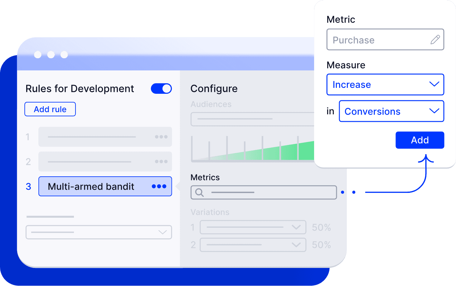
Improve Menu Hierarchy: Reorganize menus into clear parent-child categories (e.g., group “Metrics,” “Audiences,” “Results” under “Experiment”) to improve navigation and reduce cognitive load.
Guide Key Workflows: Replace static documentation with in-app walkthroughs, tooltips, and checklists for complex flows like creating experiments or analyzing results. Add dynamic panel transitions to guide users seamlessly between steps.
Enhance UI Consistency & Visibility: Standardize buttons and icons, improve visual hierarchy with color and spacing, and highlight key or underused features with tooltips and badges.
Key Findings & Recommendations
RESEARCH FINDINGS
Challenges
Challenge
Highlight 3: Some participants are confused around the ordering function
The ordering function is designed for users to adjust the order of the rules the audiences are exposed to, but it is unclear to participants.
The “ordering” button lacks visibility and clear affordances, fails to draw users' attention effectively.
“The drag (the six dots/square icon) is not obvious in the first place." -P5
Recommendations:
Enhance onboarding with micro-tutorials such as short pop-up tips or video snippets to guide users through the ordering feature.
Increase draggable area: Make the entire tile draggable rather than limiting it to the small icon, improving discoverability and ease of use.
Provide visual feedback on changes: Add a clear confirmation indicator after saving the order to reassure users.

“When I move these around, does [the order] automatically save? I’d expect some indicators on this page.” -P2
2025 by celia tsao
back to top