THSR
CASE STUDY · LARGE-SCALE QUANTITATIVE RESEARCH · AUG–OCT 2023
THSR · 2023
High satisfaction with
hidden gaps in experience.
THSR has tracked passenger satisfaction since 2007. In 2023, they combined all passenger groups into one study for the first time. The overall score looked fine. The behavioral data underneath it did not.
COMPANY
Taiwan High Speed Rail
MY ROLE
Lead UX Researcher/Project Manager @ IPSOS
METHODS
Survey · Top-2-Box · T-Test · Regression · YoY Benchmarking
SCALE
n = 1,310
TEAM
IPSOS Team
1 Project Manager, 3 Data Programmers, 2 Field Operation Managers, and 1 Research Director
THSR Team
CX team with 4+ members
95%
Satisfaction in 2024, up from 92% following research-driven changes
78M+
Yearly passengers impacted by 2024 service experience design
2023–now
Standardized data framework in use for annual tracking
01 CONTEXT
The numbers have been great, but they hid something deeper.
When satisfaction is high, but customer complaints persist, what might we be missing?
RESEARCH FRAMING
02 COLLABORATION
Who were in the room?
Me
4+
IPSOS
03 RESEARCH OBJECTIVE
Identify and understand what went wrong in the service
04 RESEARCH PLAN
Three phases in a tight schedule
AUGUST
Study Design + Survey Build
Research objective alignment with THSR, survey design, scoping and client confirmation
SEPTEMBER
Data Collection + Cleanup
Monitored field operation and data collection, cleaned up raw data, discussed data analysis framework
OCTOBER
Top-2-Box, T-Test, Regression, YoY benchmarking, data visualization, report synthesis
NOVEMBER (planned)
Focus Group
Qualitative follow-up to investigate the trust gap and ticket collection confusion surfaced by the survey. Recommended to THSR as the next research phase.
05 METHODOLOGY
Why survey?
Approach: Online Survey
We used a survey consisted of:
5-point Likert scale questions for quantitative scoring
Open-ended qualitative questions
Coverage spanned four domains: overall service, station experience, ticketing channel, and user behavior.
Statistical analysis included: Top-2-Box, T-Tests, Regression Analysis, and Year-over-Year benchmarking against prior data.
WHY THIS METHOD
→
Prioritized pain points: Provide comprehensive view of how problems relate to each other.
→
Enable statistical validation: With 78M passengers yearly, this allowed us to gather sufficient data for statistical testing against benchmark metrics with significance to validate the scale of the problems.
→
Regression analysis revealed which factors most strongly predicted overall satisfaction, giving THSR a prioritized action list
→
Timely insights for reporting: Executives required this data findings to inform future roadmap in the year-end stakeholder meeting, this would be the most efficient method.
06 RECRUITMENT
Who we heard from and how we ensured coverage
We surveyed 1,310 THSR passengers through Ipsos’ online panel, covering major corridors, trip purposes, booking channels, and travel frequency.
Recruitment strategy
To understand the end-to-end journey, we recruited passengers across different travel contexts. We maintained a consistent demographic structure so trends over time would represent service changes rather than sample variation.
Sample size
n = 1,310 valid responses after data cleanup
Criteria
16 years old or older with prior High Speed Rail travel experience
Provided feedback based on the trip taken within the survey period
Ideal vs. actual
We slightly exceeded the target sample while maintaining all quota tolerances, increasing confidence in corridor and time-of-day comparisons.
07 PROCESS
How I balance 1,300+ rows of data and time constraint
Raw data is always messy. I manually validated and cleaned 1,300+ entries using filtering formulas in Excel, removing incomplete responses, flagging outliers, building a consistent schema. For open-ended questions, I coded 400+ responses into recurring themes.
To preserve year over year comparability in a tracking study with new questions and methodology, I audited and tested the survey logic, guided stakeholders through the changes, and worked with the data programming team to redesign the analysis framework so it integrated with the internal data analysis and reporting system.
1
Data cleanup and validation
Cleaned 1,300+ raw entries in Excel, removed invalid responses, standardized the data schema
2
Qualitative coding
Manually coded 400+ open-ended responses from the survey into themes
3
Statistical analysis
Collaborated with data programming team on Top-2-Box, T-Test , Regression, YoY benchmarking across all four service domains
4
Visualization and synthesis
Translated all data into charts and a narrative report structured for client team decision-making
08 FINDINGS & RECOMMENDATIONS
What the aggregate score was covering up
01
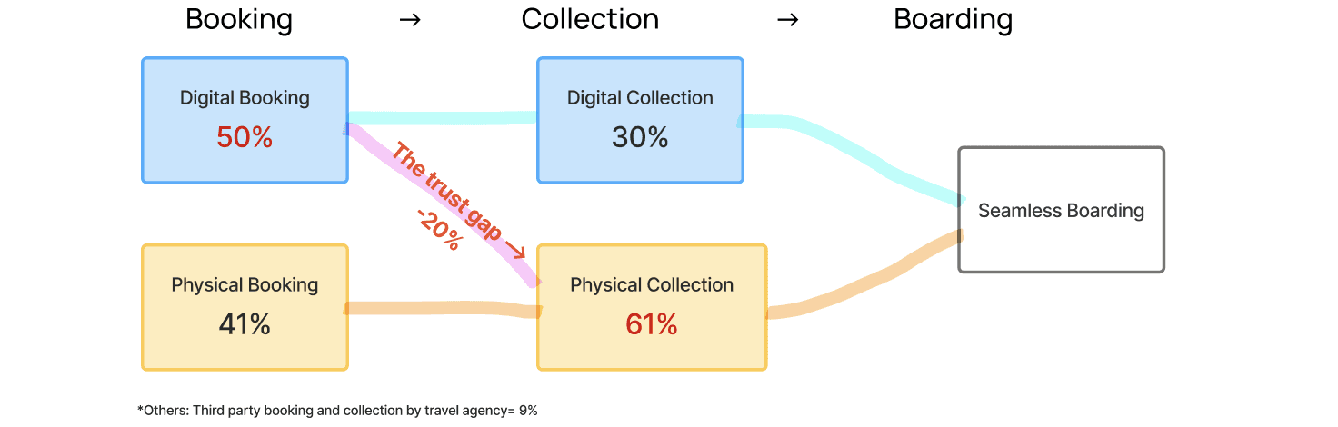
The Trust Gap
While 50% booked digitally, 61% still collected paper tickets.
20% of digital bookers still queued for a physical ticket, not by preference, but out of uncertainty. Among the 170 most dissatisfied respondents: system complexity was the top complaint. 20% said distribution instructions were unclear. 14% could not figure out how to collect multiple tickets on one device for a group.
The lost digital adoption opportunity
While half of the users book tickets digitally, 20% of them decided to stand in line at the station anyway to physically pick up tickets:

"I do not know how to distribute the ticket to my family member so we all pick up physical ones." — Rider
HOW THIS INSIGHT WAS USED
Redesign the in-app ticket distribute and collection flow with clearer guidance for group tickets.
-> The "digital experience of distributing multiple tickets" was included in our next phase of research, the focus group discussion, as the main topic to further investigate the problem and root causes.
02
The Real Driver
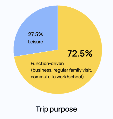
73% of trips are functional, information reliability becomes a primary driver of passenger experience quality
72.5% of trips are function-driven: commuting, business, regular family visits on a fixed schedule. For these passengers, information reliability is not a nice-to-have, but the main factor that affects their experience quality.
So we examined performance areas tied to trip information and timing:
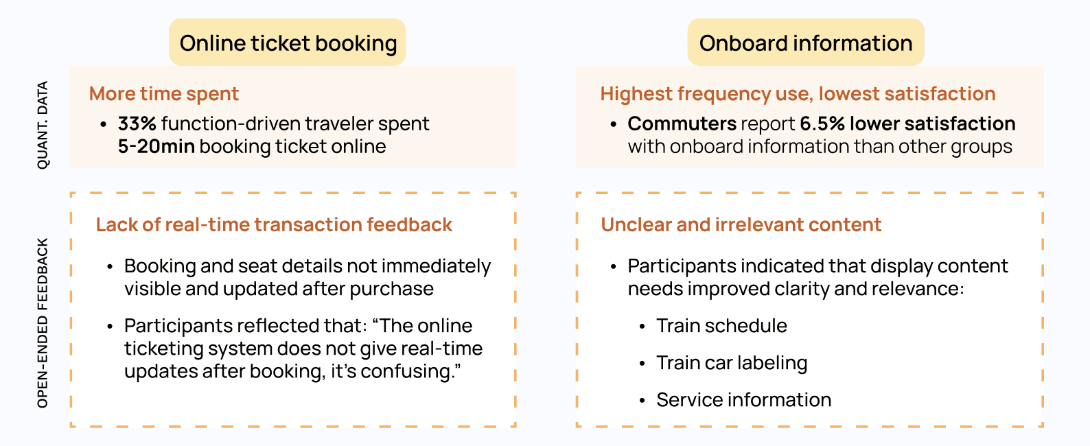
On-time performance data (OTP) (an internal operation KPI) -> 99.5%
Online ticket booking performance (time spent/ease of use) -> longer time spent
Onboard information and messaging satisfaction -> lowest score
…Then data confirmed delay was not a problem, but "not knowing why" was
While on-time performance (OTP) scores a strong 99.5% (meaning trains are strictly on schedule), frictions are identified in:
HOW THIS INSIGHT WAS USED
Longer booking duration reinforced the need to investigate the digital journey, prompting targeted qualitative research to understand why users hesitated.
Missing real-time feedback → informed the design of instant confirmation and live status updates.
Recommended a standardized, glanceable trip information design across all touchpoints to support time-sensitive decision making.
09 IMPACT
Designing change across a 78M-passenger ecosystem
The findings shaped THSR's 2024 service experience design in digital ticketing, onboard information, station operations. Satisfaction went from 92% to 95% the following year.
The study also identified three focus areas for qualitative follow-up: online ticketing system services, in-app ticket collection and onboarding experience, which informed subsequent focus group research.
POST-STUDY FOLLOW-UP DIRECTION
92% → 95%
Satisfaction increased by 3pp in 2024 — a meaningful gain on an already-high baseline, directly attributed to research-driven changes
78M+
Yearly passengers impacted by service design changes informed by this study
2023–now
Standardized data framework built during this study in use for annual satisfaction tracking to the present
10 REFLECTION
What I'd carry forward from this study
Three things I'd carry into the future study:
📐
Design for longitudinal use from day one
The standardized framework became one of the study's most lasting contributions. I'd now plan ahead for year-over-year comparability from day one when building the data analysis framework that made future measurement possible.
🔎
High aggregate scores can still hide critical pain points
92% seemed strong, but it hid a 20 point trust gap. I validate high level scores with behavioral data to uncover the real issues.
🎯
Connect friction to business cost, not just experience
Turning the trust gap into a visible operational cost made stakeholders act quickly. I make connection between UX and business impact a standard practice.